Brand Guidelines
How to use the Archotec brand correctly
Logo
The Archotec wordmark is the primary brand identifier. It uses a bold, wide-tracking sans-serif typeface that conveys precision and technological authority. The Aura Core sphere accompanies the wordmark as a visual signature.
Logo Philosophy
The Archotec logo is a stylized tree -- a universal symbol of growth, branching intelligence, and deep-rooted knowledge. It represents how Archotec AI grows and evolves alongside its user: learning, adapting, and building ever-deeper connections over time.
Built on the Golden Ratio
Every proportion of our logo is constructed using the golden ratio (1.618...) -- the same mathematical harmony found in nature, DNA helices, galaxy spirals, and the human brain. This is not decoration. It is a deliberate design choice that reflects our core philosophy:
- 1
Nature's intelligence is our blueprint -- Archotec AI models itself on organic, evolving systems, not rigid algorithms. The golden ratio in our logo embodies this principle at the visual level.
- 2
Mathematical precision meets organic beauty -- the ratio produces forms that feel inherently balanced and trustworthy, mirroring how our AI integrates seamlessly into daily life.
- 3
Fractal growth -- just as the golden spiral repeats at every scale in nature, Archotec's cognitive architecture scales from personal assistant to enterprise autonomy, maintaining harmony at every level.
- 4
The subconscious signal -- studies show the golden ratio evokes a deep sense of order and reliability. Our logo communicates trust before a single word is read.
Clear Space
Always maintain a minimum clear space equal to the height of the 'A' character around the logo. This ensures visual impact and legibility in all contexts.
Color Palette
Our palette is built on deep dark tones with a signature cyan/teal accent. These colors reflect our core values: precision, intelligence, and calm authority.
Primary Cyan
#00D4AA
--primary
Glow Teal
#00B89C
--glow-secondary
Background
#0D0F14
--background
Border Accent
#1E2A3A
--border
Typography
We use Inter as our primary typeface across all touchpoints. Its clean geometric forms and excellent screen readability align with our technical identity. Noto Sans Arabic is used for RTL languages.
Archotec AI
Archotec AI
Archotec AI
Archotec AI
Archotec AI
Aa
ABCDEFGHIJKLMNOPQRSTUVWXYZ
abcdefghijklmnopqrstuvwxyz
0123456789 !@#$%&*
Do
- Use the official logo files without modification
- Maintain the prescribed clear space around the logo
- Use the logo on dark backgrounds for best results
- Reference specific product names accurately
- Follow the approved color palette
Don't
- Stretch, rotate, or distort the logo in any way
- Change the logo colors or add gradients
- Place the logo on busy or low-contrast backgrounds
- Use the logo as part of a sentence or phrase
- Create modified versions or combine with other marks
Brand Mascot
Meet the face of Archotec AI -- our official mascot embodies the convergence of human aspiration and machine intelligence. A sentinel-class autonomous entity with the Archotec neural tree embedded in its core, symbolizing that our technology carries the seed of organic growth within a framework of engineered precision.
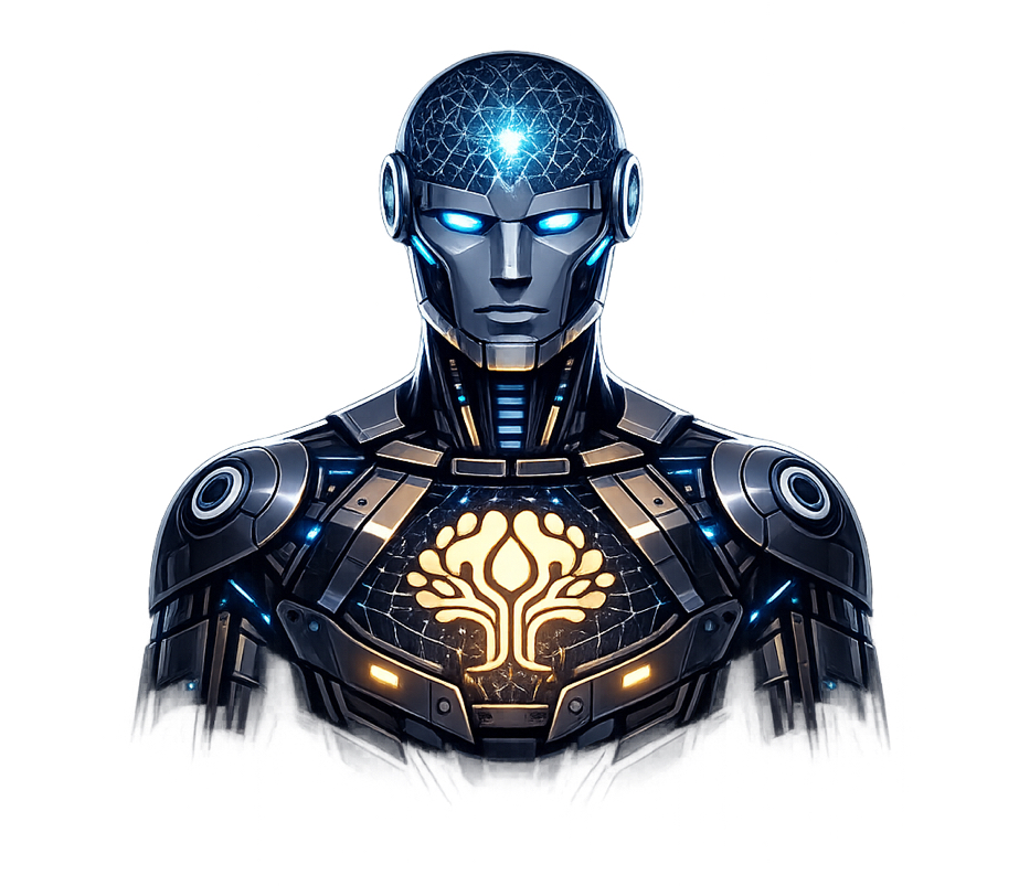
- 01
The neural tree on the chest is our logo -- a living system at the heart of the machine, representing AI that grows, not just computes.
- 02
The glowing cyan eyes and cranial mesh reflect Archotec's signature visual language: calm intelligence, always aware, always processing.
- 03
The dark titanium frame represents the robust, sovereign architecture -- local-first, private, and resilient.
- 04
The golden accents mirror the golden ratio in our logo -- mathematical harmony expressed through industrial design.
Brand Partnerships
When co-branding, maintain equal visual weight between the Archotec wordmark and partner logos. Use a vertical divider between logos with consistent spacing. All co-branded materials require approval.
Download Assets
Access our complete brand kit including logos, color swatches, and typography files.
Questions?
For brand-related inquiries, partnerships, or permission requests, contact us at brand@archotec.ai